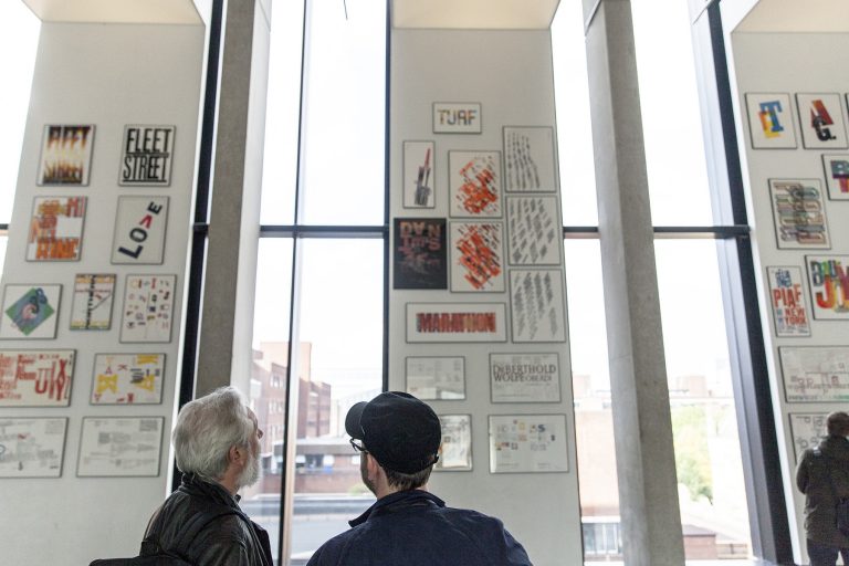
This feature by Kasper de Graaf was first published in Document 16: Design City, distributed with Creative Review in February/March 2017. Main picture: Alan Kitching and John Owens view the exhibition at Manchester School of Art, October 2016. Photo © Sebastian Matthes for Design Manchester.
The sound of Celia Stothard fills the room at 19 Cleaver Street in Kennington, transporting me to years precociously spent in the company, via my parents’ gramophone, of French chansonniers Edith Piaf, Georges Brassens and Juliette Gréco. It’s a wonderful thing, how the timbre of a voice can change the outlook of a moment.
Music is not the only thing that’s carrying me to a different age. The cupboards and shelves of the interconnected rooms and floors that make up Alan Kitching’s Typography Workshop are stacked with one of the rarest collections of wood and metal letter forms in the world, manufactured for printers to produce all manner of communications in a process that barely changed in five hundred years until phototypesetting came along.
Alan Kitching’s exhibition, ‘A Life in Letterpress’ – now at The Lighthouse in Glasgow until 5 March 2017 – was one of the highlights of DM16, spread over four floors of Manchester School of Art’s Stirling Prize-nominated Benzie Building, with a separate display of Alan’s work for ‘The Guardian’ in the window of Fred Aldous in the Northern Quarter. It was popular with students, designers and the public alike, excited by its eloquence and immediacy as much as its craft and aesthetic sensibility. To the current generation of students creating new idioms in the post-digital culture of making, Kitching’s work is supremely contemporary. The boundaries between craft, design and fine art which they challenge have never managed to constrain this man.
Yet Alan himself was never in their position. His story is painstakingly retold by John Walters in ‘A Life in Letterpress’, from his six-year apprenticeship as a compositor at J.W. Brown & Son in his native Darlington through working with the great modernist Anthony Froshaug at Watford School of Art, then his collaboration with Derek Birdsall and Martin Lee in the Omnific design partnership, to striking out on his own with the Typography Workshop in Clerkenwell – along the way becoming one of the most influential teachers at the Royal College of Art, a member of the Alliance Graphique Internationale and a Royal Designer for Industry.
Alan arrived at Watford not as a student but a technician: one whose mastery of print craft, established commitment to modernism, and naturally uncompromising outlook gave him an instant and natural connection with Froshaug. In effect it was a second apprenticeship, with Anthony Froshaug as Alan’s mentor and collaborator for seven years, at the end of which – as a kind of super-thesis – Kitching published his seminal ‘Typography Manual’ in 1970.
You get the sense that Kitching got so much from working at places like Watford and Central School of Art because it was always a two-way street. He had an informed input and attitude in every transaction. Perhaps it is a factor in what makes Kitching such a contemporary influence on students today: the original co-creator, his journey is more akin to theirs than to that of his contemporaries. That collaborative approach is something he brought into his own teaching at the Typography Workshop, influencing the development of students who in turn are now helping to shape millennial attitudes to design – Jonathan Barnbrook, Anthony Burrill, Silke Klinnert, Maja Sten, Andrew Stevens and Paul Neale among them.
If in the early 1960s a woman – his first wife, Rita – was instrumental in facilitating Kitching’s transition from print to design, so 35 years later another helped him develop a more personal approach, adding depth, power and playfulness to his art.
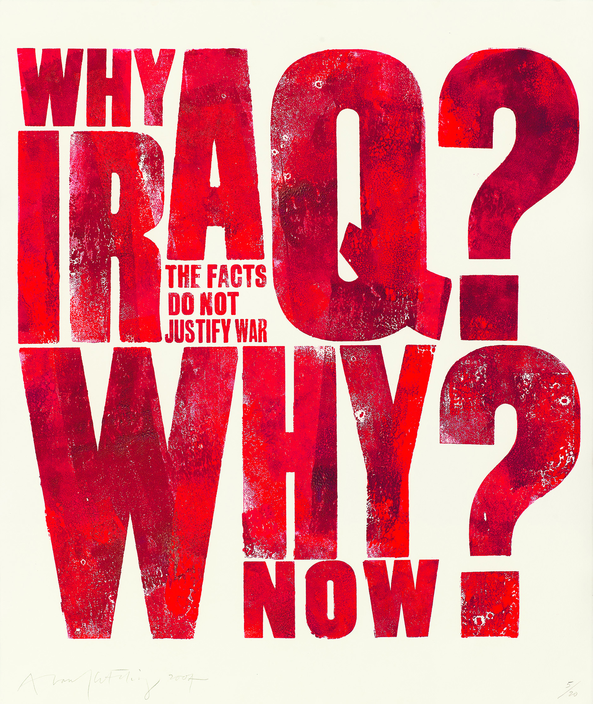
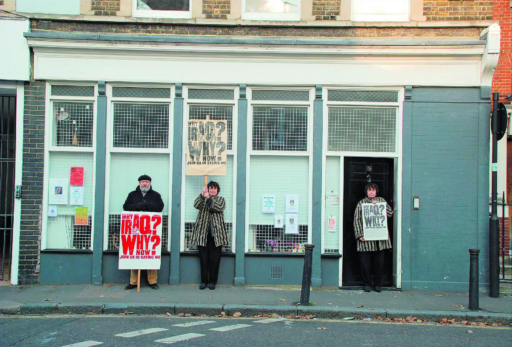
Celia Stothard and Alan Kitching shared each other’s passions: together they massively expanded the collection of original type forms and moved the Typography Workshop to their new home in Cleaver Street. Alan Kitching had never been short of opinions, or backward in expressing them in his typography – his Broadsides from 1988 onwards are towering pieces of typographic self-expression – but from the turn of the century on, his work is more infused with politics, music and local causes, opening up different registers for connecting with his audiences. The Kennington and Borough maps he created with Celia build on his previous maps of Clerkenwell and Dr Johnson’s London, but their content and tone is noticeably more personal than professional. The photograph of the two them posing outside Cleaver Street with the Iraq poster (below) shows they were deeply exercised about that cause, a passion that is clearly expressed in the work.
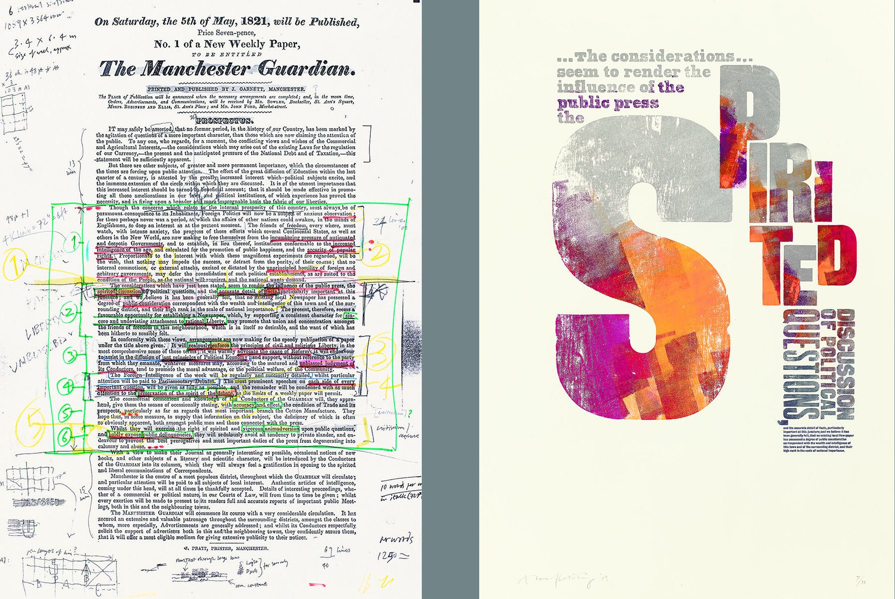
Manchester has always been a city where radical thinking has flourished, and nowhere is this more evident than in the 1821 prospectus for ‘The Manchester Guardian’, which Kitching used as the inspiration for his mural that for some years adorned the foyer of ‘The Guardian’’s Clerkenwell offices. Alan’s markings emphasise the timeless pertinence of the document: ‘antiquated and despotic governments’ should be countered by ‘increased intelligence of the age’, ‘spirited discussion of political questions’ is particularly important – albeit with ‘accurate detail of facts’ and ‘unbiassed judgment’. Is any of this less significant in the post-truth era of 2017? Kitching’s personal as much as his professional standpoint lends power to these works.
As a commercial artist, Alan Kitching has placed his skill at the service of many clients, from dance organisers and golf clubs in 1950s Yorkshire, through countless editorial commissions, to Glenlivet malt whisky packaging in 2014. The conflicts that plague some designers in balancing self-generated work with client projects don’t seem to feature much. Alan’s style has evolved over the decades, but it was always his, and that is what his clients are buying into.
‘A Life in Letterpress’ is packed with inspiration and experience, with hundreds of beautifully reproduced images tracing a career that spans six decades and dozens of collaborations, and which is still in full flow.
The workshop in Cleaver Street is a quiet hub of activity, a couple of talented and very fortunate students working on commissions in a crammed but highly organised environment where projects move from the type case to full size mockups and overlays, multiple passes on the printing press to digital scanning: centuries-old craft in a seamless production chain with new technologies.
Alan Kitching remains at the leading edge, reminding us that knowledge is valuable, craft is necessary, values are timeless, communication is human and the printed word matters. His is a voice, of sorts, that speaks for our time.
John L. Walters, ‘Alan Kitching: A Life In Letterpress’, published by Laurence King, London, 2016.